Visual reporting
March 18, 2014
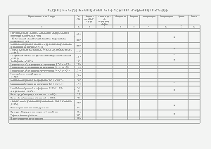
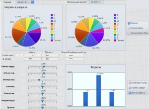
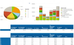
IBA GroupKirill Degtiarenko We live in the era of Big Data. These days everyone is overwhelmed with information. There’s no time to read and analyze the data that come to us from different sources. This is where data visualization can help.According to Visual Teaching Alliance, “it is hard to argue with the observation that the generation of students now moving into and through our educational system is by far the most visually stimulated generation… In fact, research shows that 65% of our students are visual learners.”They say a picture is worth a thousand words and we see how images today seize the online content. People and companies document their lives with photos. The web is turning into a visual landscape.Data visualization is already mainstream. As a result of visual presentation, complicated and potentially dull information becomes easily understandable and comprehensible.The BI market is also shifting, from tables and spreadsheets to diagrams and infographics. It is inherent to a human being to perceive visual images quicker than plain text or numbers. We “read” graphical information several times quicker than data in a spreadsheet.The user can see the key data at a glance and therefore make efficient analysis and a grounded decision.Clarity and ease of grasp make a report efficient.Based on visualized data, it is possible to make a timely and grounded management decision. High quality visualization enables managers to achieve good business results.A report title should be also catching and reflect the essence of the report in a clear and concise form. Diagrams serve as a good tool for data visualization. Color serves to highlight certain details and make selected data easy to remember.The following is an example of how a complicated spreadsheet turns into a visual report.


